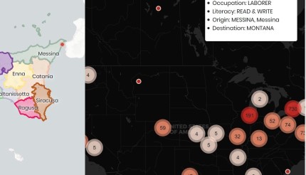
Sicily to the US: 1880-1900
I created this mobile-friendly interactive map to explore where Sicilians settled in the US after immigration. I scraped data from the National Archives' Italians to America Passenger Data File, 1855 - 1900, which is a database of Italian immigrants from transcribed passenger manifests with some demographic data and the passenger's previous residence and final destination. I then created a page with two maps, one of the US and one of Sicily, with a slider to select a year range.
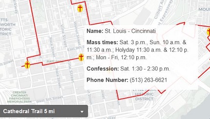
Archdiocese of Cincinnati Pilgrimage Trails
I created this mobile-friendly interactive map for use on pilgrimages planned for the Archdiocese of Cincinnati's Bicentennial. The user can select a trail through the dropdown and the map pans and zooms to that area. The informational area displays the description and directions for the trail, which can be clicked to focus the map on that stop or turn.
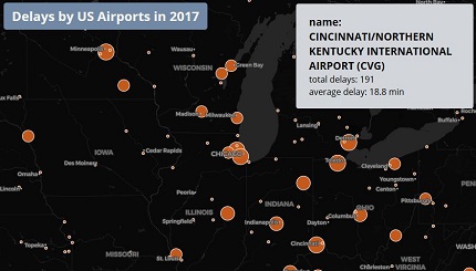
US Airport Delays
This map displays FAA data for US Airport delays in 2017. I used CARTO to store, query, and style the data (using CARTO.js 4.0). The user can mouseover an airport marker to display information in a window.
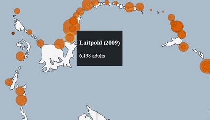
Emperor Penguin Counts
I created this map with D3.js using data from MAPPPD. The map uses a stereographic projection to display the antarctic ice shelves. A dropdown menu lets the user select which types of counts to display.
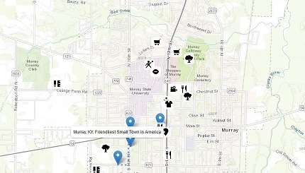
Map of Murray, Kentucky
This is a map of my hometown, Murray, Kentucky, using Leaflet. I have marked various points of interest with custom markers. The popups include information about the place, including links and images. For the marked path, I used online tools to convert Google Maps directions to a GeoJSON.
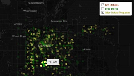
Amenities in Denver
I used Leaflet to create this map, which shows various amenities (with a tooltip showing the name) within a 1 km radius of a user's click. The points outside the radius fade. The three layers can be toggled on/off.
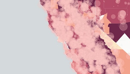
Wildfire Locations and Area Burned, 2013
This is a map of wildfire locations and total area burned in a county in the United States in 2013 made in CARTO. The individual wildfires are symbolized by graduated points corresponding to the size. I aggregated these by county to give a choropleth map showing the percent of total area burned. The opacity of the points change on zoom level and pop-ups give information about the selected item.
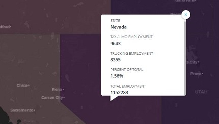
Driving-Related Jobs
I created this map in CARTO to demonstrate possible impacts of self-driving car technology on employment, using truck driving and taxi/limo drivers as jobs that may be reduced. Data is from the Bureau of Labor Statistics Quarterly Census of Employment and Wages for December 2016. The zoomed-out view shows the aggregated value of driving jobs by state as a percent of total private employment. Zooming in shows the county values.
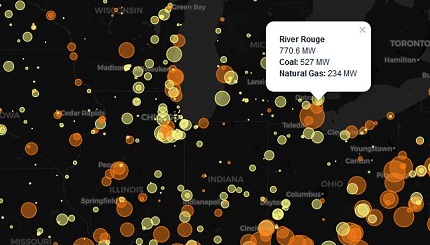
Power Generation
I created this map using Leaflet to show coal and natural gas power plants in the United States. The plants are marked by circles, where the radius is proportional to the power output. On mouseover, the marker changes color and returns on mouseout. Clicking on a circle gives an informational popup. I filtered the GeoJSON data using Leaflet's functions.
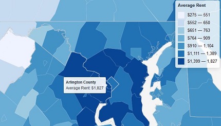
Average Rent
I used Leaflet to create this map of the average rent in the United States by county. I loaded the data using AJAX with the jQuery JavaScript library. I created a styled legend with the colors and corresponding rent range. I then added state outlines as well. I used jQuery to list the counties from highest to lowest median rent and clicking zooms in the map to the selected county.
